Imran Editz Presets
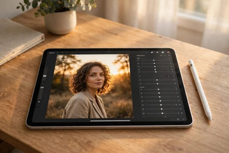
Some edits shout. The Imran Editz style whispers, and that is why it stops people scrolling. A portrait shot in ordinary daylight comes out looking like a scene from a film: deep shadows, warm skin against cool teal greens, a soft glow on the face, and colours that feel rich without looking loud. That moody, cinematic finish is the signature of the Imran Editz Presets look, and it has become a favourite for portraits, attitude reels, and night shots across Instagram.
This guide explains the look from scratch, so you can recreate it yourself in Lightroom instead of hunting for someone else’s preset file. You will learn what makes the style work, which photos suit it best, twelve named variations to try, and the exact sliders to move. Build your own version once, save it, and you will have a cinematic preset that fits your photos, your skin tones, and your light.
The Look in One Sentence
Think warm face, cool world. The subject stays warm, golden, and bright, while everything around them — the trees, the walls, the sky, the shadows — leans cooler, darker, and slightly desaturated. That contrast is the whole trick. It pulls the eye straight to the person, gives the photo depth, and creates the film-like mood that defines this style.
It is not a dark preset for the sake of being dark. The shadows are deep but they still hold detail, the highlights are controlled so skin never blows out, and the colours are graded rather than simply saturated. A good Imran Editz edit still looks like the real photo, just more dramatic, more polished, and more intentional. If your version looks muddy, grey, or orange, one of those balances has gone too far, and the slider section below will help you pull it back.
Best Photo Types for This Style
This look was made for portraits first. Close-ups, half-body shots, and attitude poses all benefit, because the warm face against a cool background creates instant separation. It also suits night portraits, street photos, and reels shot at golden hour or under street lights, where the shadows are already deep and the light already has direction.
It is less suited to bright beach photos, white weddings in full sun, or cheerful family pictures, where the mood should feel light and open. For those, a brighter look works better — compare the softer options in our guide to the best Lightroom presets for portraits before you force a moody grade onto a sunny photo. The style also needs a reasonably sharp original. Extra clarity and deep shadows will show blur and noise, so start with a clean shot and keep your phone steady.
Warm Moody Looks
These four variations keep the warmth on the face and push the mood through the shadows. They are the closest to the classic Imran Editz feel, and the best place to start.
1. Teal Orange Classic
Teal Orange Classic is the core look. Skin goes warm and golden, shadows lean teal, and contrast rises just enough to feel cinematic. Use it for outdoor portraits with trees or sky behind you, where the cool background makes the warm face stand out.
2. Moody Golden Hour
Moody Golden Hour is built for sunset. It deepens the orange light, keeps the shadows rich, and adds a soft glow to the highlights. The photo feels like the last light of the day, even when the original was shot a little earlier.
3. Dark Portrait Glow
Dark Portrait Glow darkens the background and lifts the face with a gentle radial brightening. The subject looks lit by a single soft light. It suits evening shots, dark walls, and shaded streets, but keep some shadow detail so the background does not turn to pure black.
4. Smoky Warmth
Smoky Warmth adds a light haze to the shadows and softens the contrast slightly. The result feels dreamy rather than harsh, which suits slow reels, thoughtful portraits, and photos with soft window light. Lower the clarity a touch here, or the haze will fight the sharpness.
Dark Cinematic Looks
These four go darker and more dramatic. They are best for night, streets, and attitude reels, where the mood matters more than bright, cheerful colour.
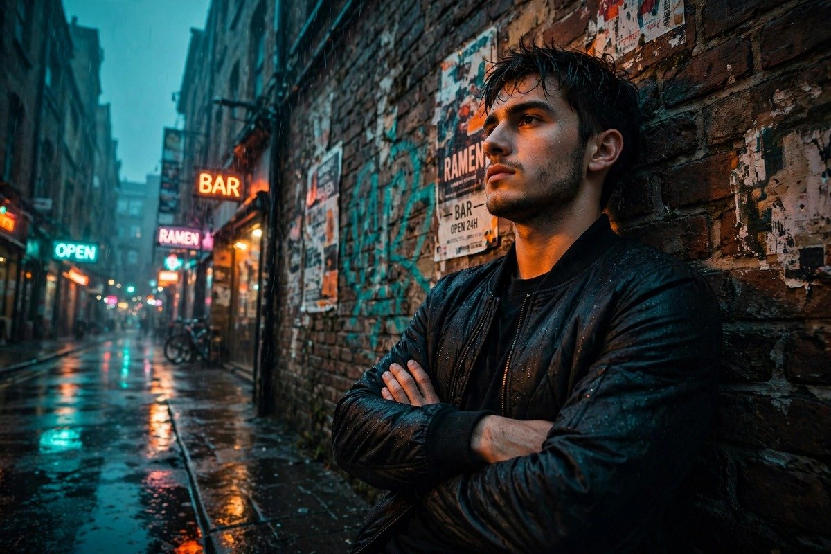
5. Night Street Cinema
Night Street Cinema is made for low light. Shadows stay deep, street lights turn warm and golden, and the face is kept just bright enough to read clearly. Use noise reduction gently, because pushing exposure in a night photo will bring out grain fast.
6. Deep Shadow Portrait
Deep Shadow Portrait pushes the blacks down and lets the face carry the whole photo. It works for strong, confident poses and black outfits, where the dark background and dark clothes frame the skin. Check the eyes and hair at full size, so detail is not lost.
7. Rainy Day Mood
Rainy Day Mood cools the whole scene, desaturates the greens, and keeps the skin warm as the only bright colour. It suits cloudy days, wet streets, and monsoon portraits, turning flat grey light into a moody, film-like scene.
8. Urban Teal
Urban Teal leans hardest into the teal side. Greens and blues go cooler and slightly darker, while orange skin and warm lights stay strong. It suits city streets, concrete walls, and bike photos, giving them a modern, edited feel without losing the subject.
Soft and Warm Looks
These four are lighter versions of the same idea. They keep the cinematic colour grading, but they are gentler, so they work on daytime photos and softer portraits.
9. Soft Cinematic
Soft Cinematic lowers the contrast, lifts the shadows, and keeps the teal-orange grading subtle. It suits couples, friends, and relaxed portraits where a heavy moody edit would feel too serious. It is also the easiest variation to use on different skin tones.
10. Golden Skin Cinema
Golden Skin Cinema focuses on the face, like the golden-skin looks in other styles, but with a cooler background. Warm the orange channel, soften the reds, and keep highlights gentle. The result is healthy skin with a cinematic frame around it.
11. Vintage Film Mood
Vintage Film Mood adds a slight fade to the blacks, a warm tint, and a touch of grain. It suits old streets, vintage outfits, and nostalgic reels. The colours feel like an old film print, warm and a little muted, rather than a sharp digital photo.
12. Reels Ready Teal
Reels Ready Teal is the lightest, most versatile version, made for video thumbnails and fast reels. The grading is clear but not heavy, so it holds up on small screens and under compression. If you only build one version of this style, build this one first.
Slider Guidance: Building the Teal-Orange Grade
Start with exposure near zero, or +0.10 to +0.20 for daylight portraits. Raise contrast to +10 to +25, lower highlights by -15 to -30, and lift shadows by +10 to +20 so the darks keep detail. Set blacks to -10 to -20 for depth, and whites to +5 to +15. Keep the temperature warm, around +5 to +10, so the face stays golden.
The grading happens in HSL and Calibration. In HSL, raise orange saturation by +10 to +15, lower green and blue saturation by -10 to -20, and shift green hue slightly toward teal. In Calibration, push the blue primary toward teal and the red primary slightly toward orange. Add clarity of +5 to +10 only — too much will make skin look rough. For a deeper explanation of colour grading, the colour grading article on Wikipedia explains how film-style grades balance warm and cool tones.
How to Recreate It Step by Step
- Fix white balance first. Set it so skin looks natural before you add any warmth, or the orange will stack up wrong.
- Shape the light. Lower highlights, lift shadows slightly, and lower blacks for the moody base. The face should be the brightest area.
- Warm the skin. Raise temperature a little, then adjust orange in HSL until skin looks golden, not orange.
- Cool the world. Desaturate greens and blues, shift them toward teal, and darken the background if it competes with the face.
- Add the film finish. Use a gentle S-curve, a little clarity, and a touch of grain if you want the vintage feel. Check the photo at full size, then save the settings as your own preset.
Once the base is saved, you only need to adjust exposure and white balance for each new photo. If you want a matching look for video, the same warm-face, cool-world idea works for reels, and our guide to AI video editing prompts for reels can help you plan the mood of the clip before you grade it.
Tips and Mistakes to Avoid
- Do not crush the blacks completely. Deep shadows look cinematic, but pure black patches with no detail look like a mistake.
- Protect the skin. If the face turns orange, lower orange saturation in HSL before you lower the temperature, so the background stays cool.
- Watch the greens. Untreated greens will look neon next to teal shadows. Desaturate them and shift the hue toward teal.
- Go lighter for reels. A grade that looks perfect on a still photo can flicker or look too dark in video. Use the Reels Ready Teal version for clips.
- Do not add clarity to noisy photos. Night shots already have grain; extra clarity makes it worse. Use noise reduction first.
- Check on your phone. Desktop screens hide how dark a moody edit looks on a phone. Preview at full brightness before you export.
Frequently Asked Questions
Does the Imran Editz look work on every photo? No. It suits portraits, night shots, and moody streets best. Bright beach or wedding photos usually need a lighter, warmer preset instead.
Can I build it on Lightroom Mobile? Yes. The full grade — HSL, Tone Curve, and Calibration — is available on mobile. Desktop is only easier for masks and batch editing.
Why does my photo look grey instead of cinematic? Usually the saturation was lowered too much, or the shadows were lifted too far. Raise vibrance slightly and lower the blacks again.
Is teal-orange bad for skin tones? Not if you protect them. Keep the teal in the shadows and background, and keep orange warmth only on the skin, using HSL and local masks.
Final Thoughts
The Imran Editz style is a balance, not a filter: warm skin, cool world, deep shadows with detail, and just enough drama to feel like a film still. Learn that balance, save your own version, and adjust it gently for each photo. Your preset will get better every time you use it, because you will know exactly which slider fixes which problem.